Introduction
For this assignment, I am going to research still life photographers such as; Jenny Van Sommers and Lorenzo Vitturi. I will then produce my own work, develop it and finalise an idea before I create my final series of photographs and display them in a Triptych style.
Research – Jenny Van Sommers
Biography Jenny Van Sommers is a photographer specialising in still life photography. Jenny works with clients such as; Apple, Audi, Hermes and Nike, living in London, traveling frequently to the America and France. Other editorial clients include Dazed and Vogue.I would like to analyse 2 photographs of her work because it relates to my project of still life using similar techniques to produce a well executed image.
Vogue Frozen

(Above) is the first image of Jenny’s that I am going to analyse titled Vogue Frozen.
The photograph is equally divided up into different segments, with the top of the frame clear, mirroring the bottom, with the lower half of the image darker than the top. Slightly off to the left, just off centre, is a sphere resting on what looks like to be a frozen plinth, slightly cracked from the top running down to the middle making you believe it might actually be an egg of some kind.
The texture of the frozen rectangle plinth has a frosty texture and a similar IOR (index of refraction) to that of glass.
Towards the lower third of the photograph, coming in from both the left and right of the frame there is a cloud, fog like mist that is about to cover the bottom of the frozen plinth. The textures in the cloud make it look very soft but also delicate.
I particularly like the lighting within the photograph because it displays a minimalistic and subtle style to the image which gives it more impact just an egg standing on a plinth. In my opinion, I think that this is a powerful photograph which has impact due to the lighting and scene set up, adding a dramatic and impressive mood throughout the image.
Wood Sphere and Paper

This photograph (above) is titled Wood Sphere and Paper, is one of a series of photographs taken similar to this. In this photograph, you can see that there is a Wooden Sphere on the left of the frame with a piece of scrunched up paper on the right.
As this photograph is also in monochrome it adds a strong contrast of light and dark throughout the image. Because of the monochrome effect, the textures on both the wooden sphere and the paper are enhanced adding more variation to the image. The scrunched up paper looks very harsh in comparison to the wooden sphere which has far less harsh curves and dramatic vertices within the object.
I do however, like the comparison of soft and harsh shown using two different objects as it demonstrates how the same light source can display both ends of the spectrum of harsh and soft.
Vogue Soap

This photograph (above) is titled Vogue Soap. In the photograph, you can see two rectangle blocks of soap standing on top of each other with another rectangle piece of soap standing upright on the left with a cylindrical piece of soap on the right. Above the pieces of soap, there are bubbles ascending up towards the top of the frame of the photograph.
The colors within the photograph are very vibrant with strong yellows, oranges and reds in the soap and a multi array of colors within the bubbles.
There are also lots of different dark and light elements throughout the pieces of soap that create different tones within the image enhancing the depth perspective within the photograph. I like the textures within the soap because it gives the image more structure and character than just plane soap.
In my opinion, I like the photograph because of it composition, textures and colours that are shown throughout the photograph to produce a vibrant and dynamic still life image.
Research – Lorenzo Vitturi
I would like to analyse some of the photographic work created by Lorenzo Vitturi. Lorenzo Vitturi is a London based artist where his work is established from found debris in the market streets of Dalston, east London. I am most interested in his still life photography work of fruit, assembled into different sculpture like forms.
(Above) is a photograph of pieces of fruit arranged as a standing sculpture. As we know that the pieces of fruit are collected from a rubbish dump, this is evident from the different textures, colours and form of each particular piece of fruit. Every fruit in the scene looks far from new or fresh but in fact dead or dying.
As the main subject of the photograph is the fruit, you can help but notice the setting that the photograph was taken in as well, with a grotty wall in the background and a rough ground surface that the fruit are standing on
Without any previous knowledge, you can tell that this photograph has a dying theme.
I predict that Lorenzo would of set up the fruit scene by attaching pieces of string or wire to the fruit and hung them from the ceiling or high vantage point and then erased out during editing. This would have allowed him to photograph the fruit in mid air creating the illusion that they are floating
The colors within the photograph are mostly dark and dingy, with little vibrancy however, the red pieces of fruit do stand out to have the most vibrant and vivid response to the rest of the colorless scene.
Overall, I like this photograph because of the textures and colours throughout the scene creating depth like the fruit are floating in mid air. The lighting within the scene is also very appropriate, creating and enhancing the textures and contrast throughout the setting.

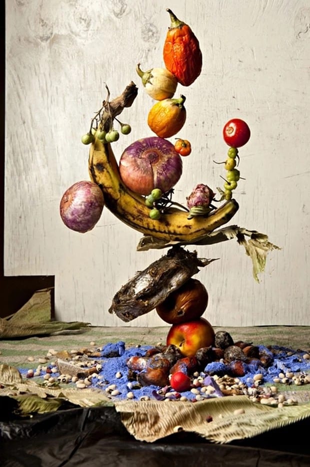
(Above) is another photograph taken by Lorenzo Vitturi. This photograph is following the same theme as the last with food being the center focus but the stand on which the objects are situated on are on what looks to be a brick and some wiring something that creates contrast with the colorful food objects.
The lower half of the sculpture is a very vibrant red colour while other elements are either a subtle green or browns. The background of the photograph is of a blue wall with the upper section orange.
Like the previous photograph, it does display lots of different textures that make up a complex scene contrasting with the vibrant colors sure as the reds against the browns.
I like this photograph because of its subtle contrast or vibrant against dark and grotty colors evident in it being a brick with colorful food.
Next Steps
After conducting the above research on Jenny Van Sommers and Lorenzo Vitturi, I believe that it is important that I focus on the composition of each photograph so that each image looks seamless and not out of place. The concept of the idea is also important especially if I would like to connect each image with one another.
Photo Shoot
Planning
For this photo shoot, I would like to photograph three different images of an orange. the first image is of the orange whole, with its skin on. The second photograph is of the orange peeled and half eaten and the final photograph is of the orange fully eaten with just the remaining orange peel on the ground.
I will be photographing the fruit using a Canon DSLR with a ——- lens to create a shallow depth of field. I will create my own backdrop of the scene and use a bedside light to light the scene accordingly.
One of the most important factors about this photo shoot is keeping the camera in one position and only moving what is in the shot, making sure what is not supposed to move stays in one position.
Below is a contact sheet of the images that I took.

From these 19 images I took, I picked 3 to further develop (below).
I wanted to produce a simple theme throughout all three of the photographs. I did this by keeping the location of the orange in the same place, on the same background with the same lighting setup and camera setting. The only elements that I changed were what actually happened in the scene. The first photograph is just of an orange with lighting coming in from the left of the image. the shadow falloff is quite harsh but in my opinion, I like this contrast between the light and the dark on the fruit as it is like the fruit fades off into space, less so if there was a less of a falloff from the shadow.
The middle photograph is of a quarter of the same orange having been cut out photographed in the same position, scale and rotation. In the foreground of the image, you can see eight small chunks of orange peel. This lower third of the photograph is blurred because of the narrow depth of field that I used, using an F-stop value of F/5.6 with a focal length of 50mm.
The last photograph is of a pile of orange peels from the same orange with the stalk part of the fruit still at the top. I have also maintained the location of the previous orange peels in the scene to manage and continue the continuity throughout the triptych.
What I wanted to show throughout my triptych photograph was a figurative process of eating an orange throughout the different stages. I would like to create an edit of this triptych by erasing the boarders between each photograph and by enhancing the background of each image, improving the continuity throughout the triptych.

This is the edit that I have created using Adobe Photoshop. In the edit, you can see that I have erased the white boarder and replaced it with a less harsh grey boarder. Looking at the photograph, I believe, that a less harsh white boarder allows you to focus your attention onto the actual images rather than being distracted by the contrasting harsh white. This also keeps the photograph a triptych than merging it all into one.
In my opinion, I like this triptych because of its minimalistic style and theme . I also think that this enhances what you are actually looking at rather than getting distracted from a harsh white boarder.
I also think that researching Jenny Van Sommers and Lorenzo Vitturi has had an influence on my work in regards to lighting and composition.