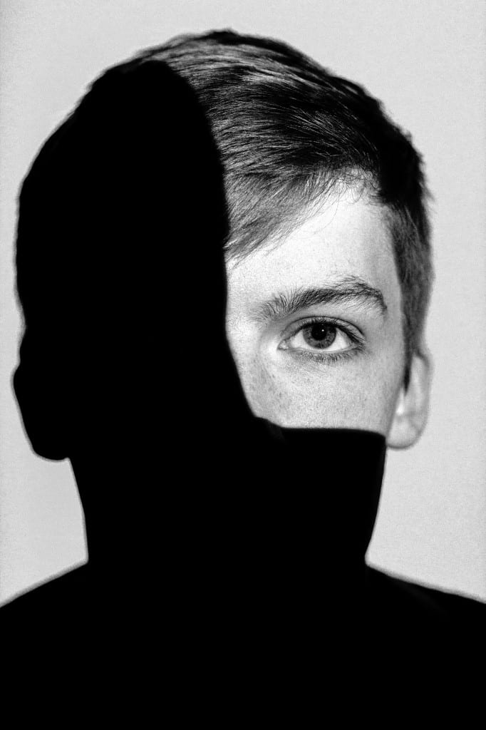
This photograph was taken using a Cannon 700D with a 50mm prime lens. The photograph has a shallow depth of field with the focus being on the models left eye with the rest of his head falling off into bokeh.
To the right of the models left eye, the rest of the photograph has a strong black cast of a shadow present, creating a silhouette style throughout the photograph. The top left of the models head is uncovered from the shadow showing the detail, textures and tones within the models face.
The lighting technique that I used within the scene to help me achieve the harsh shadow against the correctly exposed quarter of the models face was a projector light, with the light only projecting onto the quarter of the models face which you can see in the photograph.
I took the photograph using fully manual settings with settings of:
- ISO 800
- F/3.5
- 1/160th of a second shutter speed
- 50mm focal length
- Spot metering directed on the models eye
- No flash
The process of taking the photograph was simple. I first set the camera to spot metering, centre spot auto focus (with one shot focus) and then pointed the camera at the focal point of the subject which in this case was the models eye. I then changed the exposure settings within the camera manually and locked these settings by pressing the ‘*’ button on the top of the camera. I finally refocused, recomposed and shot the image.
The original photograph was taken in RAW and then converted to black and white. Shooting the image in RAW allowed me to capture strong and prominent features throughout the limited exposure of the models face. I converted the image from colour to black and white because I wanted to highlight the strong contrast throughout the image from the harsh shadow against the clear textures and tones of the left quarter of the models face.
The post production for this image consisted of increasing the blacks, the contrast and adjusting the detail to bring out the minor details within the models face. These elements have ultimately sharpened the photograph, developing the details and multiplying the contrast values throughout the image.
The concept for this image was to express a question of identity with the shadow covering 3/4th of the models face.
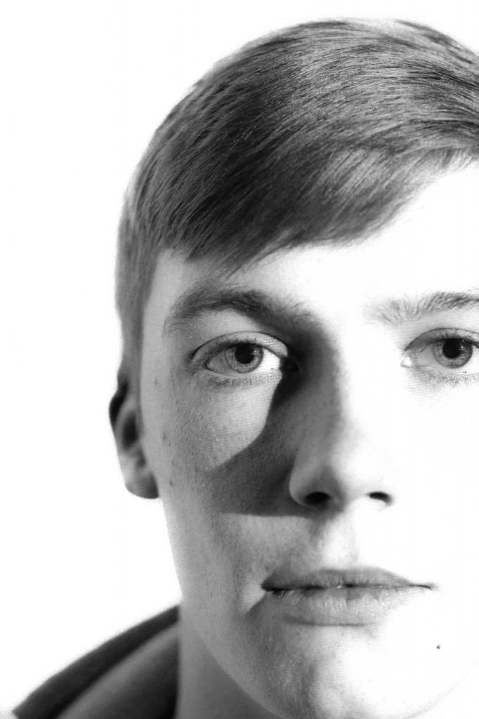
This photograph was taken using similar techniques to the last using a projector to light the subject.
The camera settings were the same as the previous photograph apart from the shutter speed which I changed to 1/125 of a second to capture a slightly brighter exposure throughout the image.
The type of lighting that I wanted to express was the Rembrandt lighting style. This style is evident in this portrait photograph because of the triangular patch of light just below the models right eye. This path of light was created by the models nose casting a shadow just below the inner contours of the eye.
The photograph was again, originally taken in colour and I then converted it black and white. I believe that this image works well in black and white because of how the light and dark tones are revealed.
In the post production for this image, I wanted there to be a high contrast between the white light on the left of the models face compared to the right of his face. In Adobe Photoshop, I increased the white values within the image making the left of the models face over exposed. I then increased the shadows value throughout the photograph to bring back the details lost in shadows on the right of the models face.
The shallow depth of field suits the photograph because of how the focus is again on the models eye and the rest of his face fades off into bokeh. I like the composition of the image and how part of his face is cropped off the side of the frame. This focuses your attention on the focus of the photograph, his eye. For me, when I look at his eye, the next place I look at is the Rembrandt lighting effect, his nose, down to his mouth and then finally to the petite spot just to the lower left of his mouth. I really like this subtle spot as it adds character to the photograph. I also like the textures that you can see in his hear as this gives the photograph more of a complex structure.
Overall, I like this photograph because of the composition, contrast and the Rembrandt light effects.
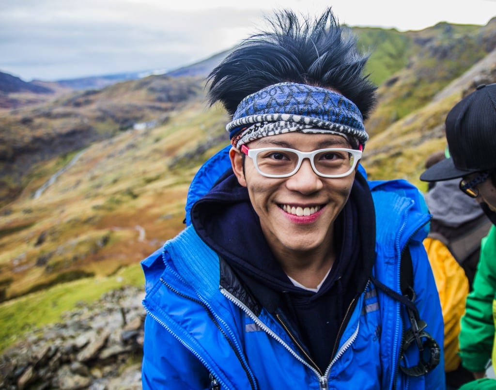
This photograph was taken during the climb up to the top of the highest mountain in Wales, Snowdon. The photograph was taken on the 7th of November 2015 around 10:30am. As the lighting was natural for this photograph, timing was critical to not capture a full shadow over the man’s face. The sun was strong, lighting up the environment well but not harsh to cast strong shadows on the subject and on the landscape. Because the sun was moving behind a cloud, it defused the light creating more of a fill light than acting as direct sunlight.
The camera settings I used were:
- F/2.8
- 1/125th of a second shutter speed
- ISO 100
- 17mm focal length
I used a small aperture value of F/2.8 because I wanted a shallow depth of field picking out subject from the background and also allowing more light to enter the scene and retain a low ISO value to minimise noise throughout the image.
I also really like the colours throughout the photograph because of how vibrant they are in such a colourful environment.
Focusing on the structure of the man’s face, his skin tones are very even with slight shading from his shadows created by his cheek bones from his smile. Looking further at the small details within the photograph, you can see that on his glasses there are small water droplets which indicates that it has been raining.
I think there are five elements that show off the man’s character in the image. The first being his smile, the way he is looking into the camera with his cheeks evenly pulled back. The next character signifier is his hair. His hair stands up strongly where you can see each strand with all of its textures and different lengths. The man’s glasses are also very vibrant along with his blue jacket that he is wearing as well. The glasses have a white rim and red sides. This is a strong contrast in itself. The man’s banner is also unique to his style which co-ordinates well with his jacket. The final factor that defines his character is his watch, being that it is a heavy duty watch which is attached to his rucksack.
I also like the composition of how the photograph was taken as the man is just off to the right, off centre, allowing you to see the mountainous landscape in the background.
Overall, I really like this photograph because of the strong textures and tones that are present within the sky and on the man’s face. I also like the strong vibrancy of the colours throughout the photograph as it makes certain elements stand out. Finally, I like the moment in which I have captured the man’s portrait, how he looks happy, climbing the mountain, in a safe place where there is no worry.
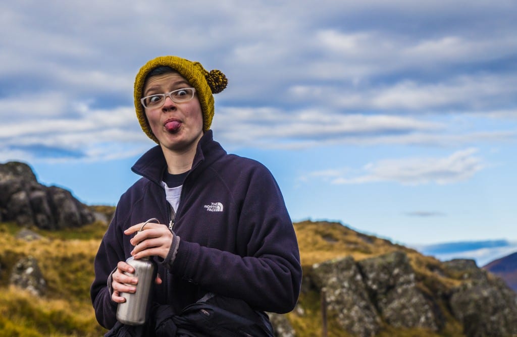
This photograph was taken on the same day, slightly higher up the mountain around 11:00am. The photograph was also taken pointing in the same direction as the last image to avoid any harsh shadows forming on the models face. The camera settings were:
- F/5
- 1/500th of a second shutter speed
- ISO 100
- 46mm focal length
As the lighting was slightly harsher in this image compared to the previous, I needed to increase the aperture value to allow less light to enter the camera. The compromise was that the background is slightly less blurry. Nevertheless, this did increase my chances that the subject would all be in focus which as it turns out the subject is.
I really like the colours and composition of the photograph and how the models mustered coloured hat co-ordinates well with the colours in the background. The jumper that the model is wearing also relates well with the environment because of the similarity of tones present in each.
I really like how I have capture the expression on the models face as she is sticking her tongue out at the camera. This was made possible by the fast shutter speed enabling no motion blur or distortion.
Overall, I really like the photograph because of the colours that relate to each other throughout the different elements. The composition is also good because of how the model is slight off to the left, off centre creating a balance throughout the photograph. Even though the photograph looks posed, it is not, the model stuck her tongue out at me and then I snapped it. I think for that reason, it still makes it look natural and not forced especially as she is doing something with her bottle as well. The model again looks happy think they want to be where they are, climbing the second highest mountain in the UK.


